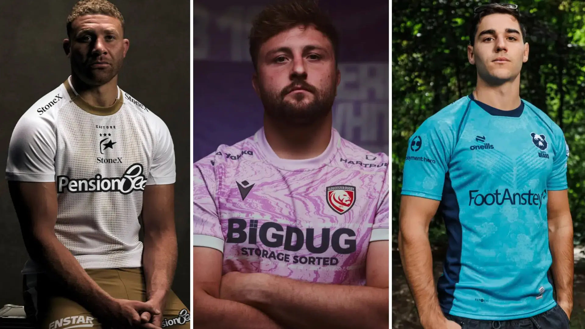

With the 2026/27 PREM Rugby season just weeks away, attention is turning towards which sides will look best on the pitch when the action gets underway.
While performances will ultimately determine the pecking order, there is another important battle taking place off it. We have ranked every club’s away kit to determine who has come out on top in the style stakes this season.
10 Leicester Tigers
This has been the most high-profile away kit launch, although certainly not for the right reasons. The colour scheme is simply bizarre.
Mauve is an unusual choice with seemingly little connection to the city of Leicester, while the execution has left plenty to be desired.
Trying something different is always commendable, but this one has missed the mark. Fans have made their feelings clear, and it is difficult to argue with them.
9 Newcastle Red Bulls
After playing it safe with their home shirt, you might have expected Newcastle to go bold with their away kit. Instead, they have gone in completely the opposite direction with a plain white shirt that looks remarkably similar to a Leeds United football shirt.
It is painfully boring, although to be fair, there is nothing particularly wrong with the shirt itself. It just feels like a missed opportunity.
8 Harlequins
Much like their home shirt, there is plenty to like about this Harlequins offering. The blue base and geometric patterns look very good, but unfortunately the huge yellow DHL logo across the middle completely dominates the design.
The sponsor simply does not blend with the rest of the colour scheme. It is a shame because without it, or with a sponsor that fitted the design better, this could have been much higher.
7 Northampton Saints
Another perfectly decent shirt that does not quite do enough to stand out. The DPD sponsorship is prominent, although the red actually works reasonably well against the white.
There is nothing particularly exciting about the design, but it is certainly not a bad shirt. Overall, it feels very much like a middle-of-the-road offering.
6 Bath
The light blue fading into white at the top makes for a smart-looking shirt, but there is something rather generic about the overall design.
It looks good, but perhaps that is the problem. There is not a huge amount going on, with large sections of white space making the shirt feel slightly underdeveloped. It is clean and attractive, but ultimately a little boring.
5 Gloucester
Gloucester have gone for a really nice shade of pink, complemented by some interesting patterns, and the overall result is a very good-looking shirt.
The main thing holding it back is that the various shapes do not appear to have any particular meaning or connection to the club. That puts it behind some of the designs with a stronger sense of history and identity.
Still, purely from an aesthetic perspective, there is very little to complain about.
4 Exeter Chiefs
This is something of a mish-mash, but somehow it works. The design takes inspiration from the shirt worn by the Chiefs against Coventry in September 2006, which was the first match played at Sandy Park.
Having Sandy Park incorporated as the sponsor adds an extra layer of authenticity and makes the connection to the club's history even stronger. The combination of light blue, black and white is not an obvious one, but Exeter have pulled it off surprisingly well.
3 Bristol Bears
A really clever concept that has been executed extremely well. The flower pattern is inspired by the local whitebeam tree, while the design also ties into the club's focus on environmental sustainability.
The shade of blue works brilliantly with the pattern and the overall result is a very attractive shirt. It feels distinctive without becoming overcomplicated, making this one of the better away kits in PREM Rugby.
2 Saracens
Just as black and gold worked brilliantly on Saracens' home shirt, the combination of white and gold looks equally impressive here.
The sponsor fits neatly into the design, while the centralised logo gives the shirt a smart, modern look. It also has the kind of design that would not look out of place away from a rugby pitch, which feels very Saracens.
Gold shorts are a bold choice too, which has to be respected.
A big fan of this one.
1 Sale Sharks
Sale take top spot with what is, in my opinion, the standout away shirt. The combination of white and light blue looks excellent, while the collar adds another nice touch to an already impressive design.
The shirt has been inspired by the structures of the steelworks that have played such an important role in Greater Manchester's history, giving it a strong local connection.
It is relatively simple, but that works in its favour. There is enough detail to make it interesting without overdoing it, and Sale are deservedly sitting at number one.
Editors Picks:
- The 10 greatest Springboks of the Rassie Erasmus era – ranked
- 2026: The 10 fastest rugby players in the world right now – ranked
- Jeremy Guscott urges Steve Borthwick to drop 105-cap England star
- Leicester Tigers facing ‘hefty’ battle to keep Ollie Chessum
- Cam Roigard named among rugby’s five most infamous ‘divers’
TRENDING




LATEST NEWS


LATEST COMMENTS
- Jordie Barrett over Damian de Allende is far from being correct. The hype around Dupont is also overreaching, he's probably 4th in the world and has been since the 2023 WC. He also avoids certain matchups which is strange. The rest of the list is pretty good apart from minor subjective biases.JasonMarlow16-09-2026
Loading