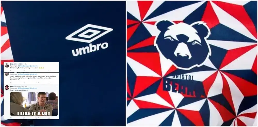

Bristol Bears have launched their new high-performance training wear collection in partnership with Umbro.
SOCIAL REACTION:


On sale online and in store, the collection includes items for gym wear and on-field training:
- Warm up jersey (worn by the players on pitch ahead of the game – also available in junior size)
- Gym Tee (also available womens/junior)
- Gym Short (also available in junior)
- Singlet (also available in junior)
- Mid layer top (also available in womens/junior)
- Tapered pant (also available in junior)
- Polo (also available in womens/junior)
You can check out the full range here.
JOIN THE RUCK:
LIST | The 5 absolute worst Premiership Rugby kits EVER

1. Worcester Warriors - Away, 2020/21
The Warriors have had some poor away jerseys down the years, but this latest design from O'Neils looks particularly awful.
Credit: Fab Rugby

2. Northampton Saints - Away, 2017/18
This lime green effort looked more like if Dipsy from the Teletubbies was sponsored by Toolstation.

3. Newcastle Falcons - Away, 2017/18
The jersey, designed by ISC who are known more for their rugby league kits, does look like a rejected Wigan Warriors away shirt.

4. Harlequins - Away, 2019/20
Let’s be honest, neon isn’t for everyone. Whilst Adidas consistently smash it out of the park for the Quins home kit, this away kit isn’t one of their finest. Frankly the shirt is just a bit too much on the eye and is a move away from the lowkey traditions of rugby kits.

5. Leicester Tigers – Away, 2012/13
The Tigers are a team with a proud history, hailing from rugby’s historic heartlands in the East Midlands. Their shirts reflect this, usually opting for hooped shirt designs of some sort, using their club colours of green, red and white. In recent years however , with clubs relying on shirt sales to boost their ever increasing budgets, shirt designers have been tasked with making clubs’ shirts noticeably different each year, in order to encourage people to buy the latest shirt. This one was a major fail.

TRENDING




LATEST NEWS



LATEST COMMENTS
- Jordie Barrett over Damian de Allende is far from being correct. The hype around Dupont is also overreaching, he's probably 4th in the world and has been since the 2023 WC. He also avoids certain matchups which is strange. The rest of the list is pretty good apart from minor subjective biases.JasonMarlow16-09-2026
Loading
