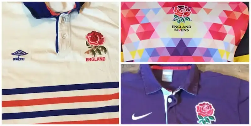

Feast your gaze on these horrible England eyesores from down the years...
1. Sevens - 2013
Getting a bit more adventurous with this kaleidoscopic cornea burner from the England Sevens team. Thes multi-coloured front seems reminiscent of a dance-floor in a cheesy 70's disco club. Extraordinary.

2. 1980's - Umbro
If this is any indication of what their jerseys will be like moving forward, we could be in trouble after Umbro officially took over from Canterbury, signing a four-year deal with the RFU.
Looks like a toddler’s crayon rampage,

3. England away - 2009
Apparently the choice is a 'regal' shade of purple, fit for a country known for its royalty.
The fact England never won in this shirt means it should never be done again. Oh wait, it was, but a little bit better.

4. Rugby World Cup - 2007
Four years on from their World Cup triumph, Nike completely changed their design and as good as it looked on a model it was not exactly the most attractive on the pitch with splashes of red on the shirt and shorts looking incredibly messy.
However, England were able to reach a second successive World Cup final, but this time narrowly lost out 15-6 to the Springboks at Stade de France.

5. England away -2014
In between World Cup cycles there's a touch more room for creativity and the 2013-14 alternate strip certainly look heed to that view.
The 2013-14 change of jersey caused quite a stir when it was launched, but anyone who bought it was left disappointed as it was only actually worn in competitive matches by the women and U20s during that season.
Its design cues came from the painting of the 'The Battle of the Roses: Yorkshire versus Lancashire' that hangs on the wall of the President's Suite at Twickenham Stadium.

TRENDING





LATEST NEWS



LATEST COMMENTS
- Jordie Barrett over Damian de Allende is far from being correct. The hype around Dupont is also overreaching, he's probably 4th in the world and has been since the 2023 WC. He also avoids certain matchups which is strange. The rest of the list is pretty good apart from minor subjective biases.JasonMarlow16-09-2026
Loading