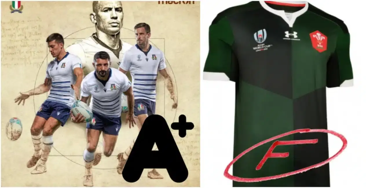

Several countries have unveiled their jerseys for the upcoming tournament in Japan, so we've donned our judge's hat on to run the rule over them all...
With just three months to go until the big kick-off in Japan, it's officially time to start getting excited about the ninth edition of the greatest show on earth.
Fear not, however, for RUCK is here to sort the delightful from the dire, with this list ranking all of the Rugby World Cup 2019 jerseys unveiled so far...
ARGENTINA
Home: A - A wonderfully vintage-inspired jersey sporting the classic blue and white hoops.
Away: B - The alternate shirt on the other hand, is rather leftfield – with its mix of blue, gold and hot pink, it’s certainly eye-catching.

AUSTRALIA
Home: B - Very nice without being particularly standout. Clean and classic.
Away: C - It brings the concept of an ‘Indigenous’ jersey to the World Cup, but looks a bit too like a South Africa jersey.


ENGLAND
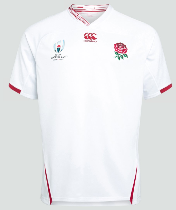
Home: A - Reminisces of England's 2003 shirt. England have stuck to their roots with the traditional white with red trim for their home shirt.
Away: D - Looks like a training top. Actually, the training range is probably nicer. The English might be one of the tournament’s favourites, but this kit is getting dumped out in the pool stages.

FIJI
Home: A* - Don’t think perfection exists? Think again. ISC have produced, in our eyes anyway, the best set of kit for the 2019 Rugby World Cup so far.
Away: B - The same as the home shirt but in black. Again top work.


FRANCE
Home: B - While lacking in the inspiration department, the France home jersey isn’t all that bad. We like the two shades of blue.
Away: D - Not even the a colourful logo can save this plain jersey from looking bland.


Italy
Home: B+ - Slick and simple. Nice shade of blue.
Away: A - The alternate is white with a lovely light and dark blue pinstriped motif on the front.


JAPAN
Home: A - They are inspired by the Samurai code, and feature angular squared off V-shaped hoops accented with gold to represent the sun reflecting off Mt Fuji.
Away: A - Two incredible shirts for the biggest of occasions.


NEW ZEALAND
Home: A - Designed in collaboration with Y-3, the shirt has a 3D textured effect that looks like it’s actually made out of ferns. We really like it.
Away: C - An All Blacks jersey that isn't black will never score well.


SAMOA
Home: B - Not quite as striking as the 2015 versions, but still feature striking Samoan art on the sleeve and body of the jersey.
Home: C- Looks nicer in blue.


SOUTH AFRICA
Home: B+ - A nice blend of classic and modern.
Away: B - A very modern white and gold collar looks tidy.


WALES
Home: B - These kits caused the most debate in our office. Overall, we fo like the home shirt.
Away: F - It was a bold choice that could have gone either way in terms of fan reaction. Some fans seem to like it but the majority of our office is not keen.


EDITORS PICKS:
TRENDING






LATEST NEWS





LATEST COMMENTS
- Jordie Barrett over Damian de Allende is far from being correct. The hype around Dupont is also overreaching, he's probably 4th in the world and has been since the 2023 WC. He also avoids certain matchups which is strange. The rest of the list is pretty good apart from minor subjective biases.JasonMarlow16-09-2026
Loading